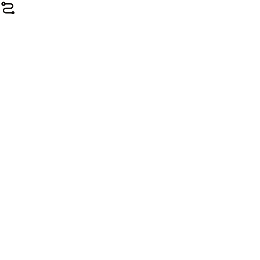
The mark
A switchback route: three uneven runs — the days — joined by half-turns, leaving an open departure ring and arriving at a filled disc. The runs are unequal because real days are. It is the same drawing as the route line on the landing page, at a different scale.
The mark, at the sizes it lives at
Below about 20px the open departure ring fills in and reads as a blob, so the favicon drops it and thickens the stroke. That is the same mark drawn for its size, not a second logo — use mark-app-icon.svg when it must survive being tiny.
Files
| File | Use it for | Download |
|---|---|---|
| mark-ink.svg | Default. Ink on any light ground. | SVG |
| mark-stone.svg | Reversed, for dark grounds. | SVG |
| mark-app-icon.svg | Filled tile, for app icons and avatars. | SVG |
| mark-current.svg | Inherits currentColor — for dropping into code. | SVG |
| wordmark-ink@3x.png | Mark + name, for decks and documents. | PNG |
| wordmark-stone.png | Mark + name, reversed. | PNG |
| mark-ink-512.png | 512px raster, where SVG is not accepted. | PNG |
| mark-app-icon-512.png | 512px app-icon tile. | PNG |




The mark is vector and has no font dependency. The wordmark ships as PNG because its lettering is live type — it is the mark beside “Travel Buddy” set in Geist Light at -0.03em tracking, so anyone with the font can rebuild it at any size rather than scaling a raster.
Colour
Ink
#0c0a09
Text and the mark. Never pure #000.
Canvas
#f5f5f5
The page.
Primary
#292524
Button fill.
Body
#4e4e4e
Running text.
Muted
#6f6961
Secondary text.
Hairline
#e7e5e4
Dividers. Separation is a line, not a shadow.
Route
#0447ff
Product visuals only — never chrome.
Stamp
#ff4704
Product visuals only — never chrome.
The rules that matter
- Give it room. Clear space on every side is the height of the arrival disc — about a fifth of the mark. Nothing sits inside that.
- Never redraw it. The runs are deliberately unequal and the turns are true half-circles. Redrawn by eye it becomes a generic flow icon. Use the file.
- The blue and the orange are quarantined. They belong to product visuals — the route line, the Stamps — and never to a button, a link, a border or the mark itself.
- Never pure black. The ink is
#0c0a09, warm. Pure#000reads cold against these stones. - No effects. No gradient, no shadow, no outline, no rotation. The world is flat and the separation is a hairline.